
Digital service maps
09 August 2014
Everyone spoke of an information overload, but what there was in fact was a non-information overload - Richard Saul Wurman, What-If, Could-Be
Edward Tufte includes this quote before setting out the ‘Theory of Data Graphics’ in his seminal book The Visual Display of Quantitative Information. His theory builds from the notion that information visualisations should seek to clearly portray complexity. This empowers the viewer and enables them to spot patterns and make decisions that they weren’t able to previously.
If digital professionals had better visualisations then they would probably be able to make better decisions too.
A major challenge at many organisations is managing the multiple touchpoints, particularly when there are several distinct audience or customer groups. Which customers are being targeted by which channels? Where are the opportunities for growth? Where is the scope for consolidation?
I’ve developed a simple visualisation which helps to address some of these questions. It shows all of the digital services which a particular audience or customer group might interact with.
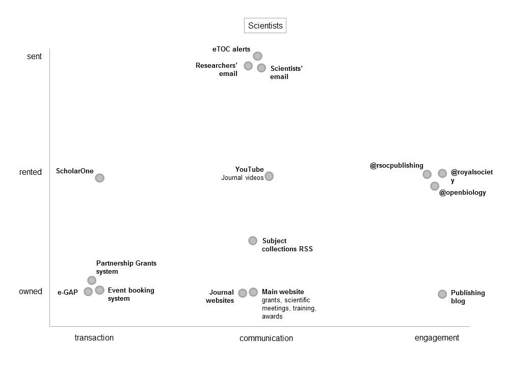
The horizontal axis is the style of interaction:
- Transactions: When the organisation makes a business-like exchange with others
- Communications: When the organisation communicates its messages outwards to others
- Engagement: When the organisation listens to, responds to and engages with others
The vertical axis is the place of consumption:
- Owned: When the service is consumed on the organisation’s own software (e.g. its website)
- Rented: When the service is consumed on third-party software (e.g. social media)
- Sent: When the service is consumed on the customer’s own software (e.g. email, RSS)
These aren’t the only important properties of a digital service, but together they provide an interesting at-a-glance view of the customer’s digital experience.
They can also be used to compare the experience for different customer groups or the experiences offered by different organisations.
comments powered by Disqus